Microsoft Azure Pricing · Virtual Machines · 2024
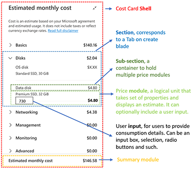
Cost Card
Bringing real-time pricing transparency to the Azure Portal allowing customers to know exactly what they'll pay before they commit.
A pricing widget that has become the standard to drive measurable business impact and delight millions of cloud customers.
Visit Azure Portal
+20%
Conversion
−21%
Abandonment
−34%
Incidents
99.9%
Reliability
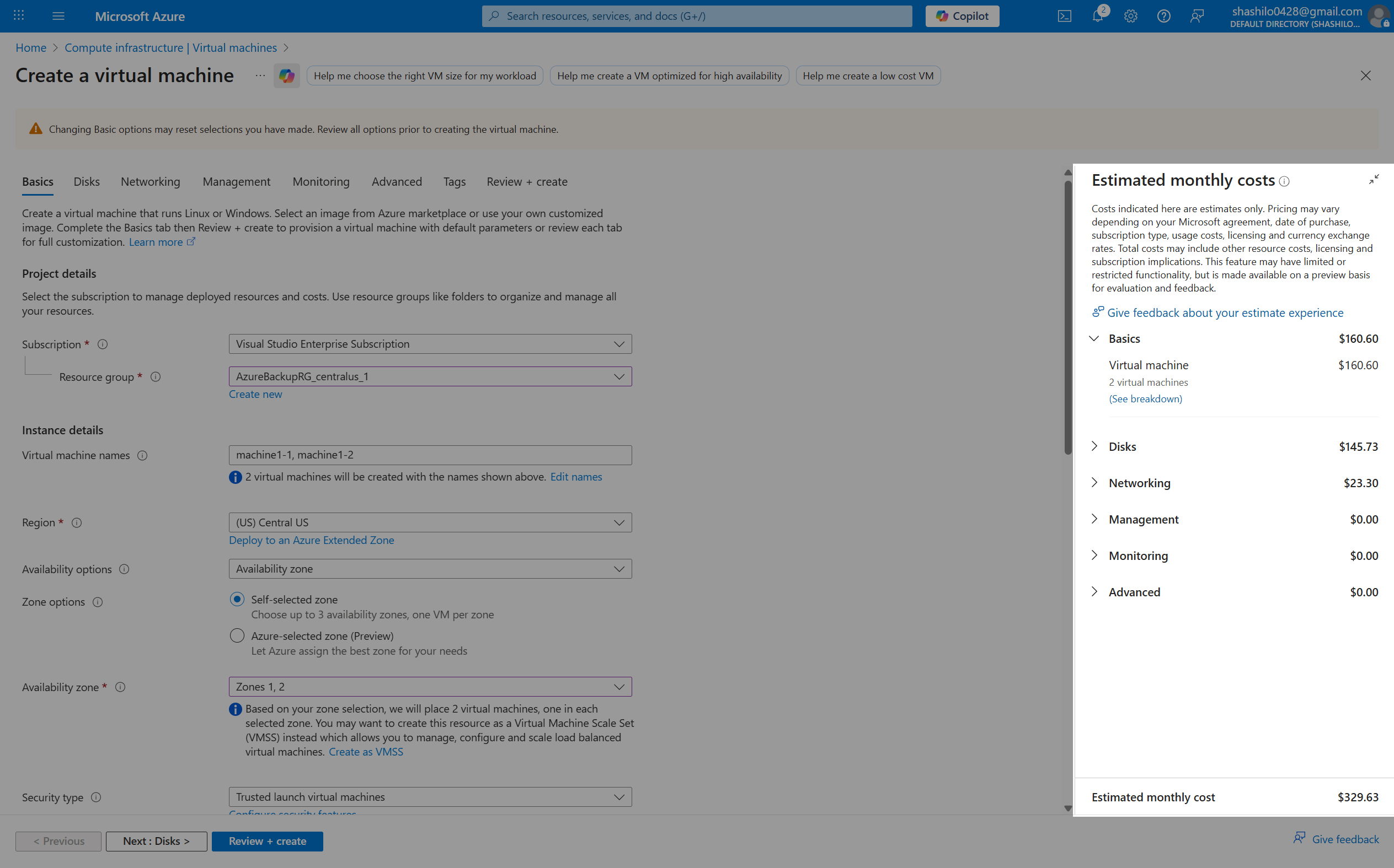
https://portal.azure.com/#create/Microsoft.VirtualMachine-ARM
Scroll to explore